大家好,我是潘Sir,持续分享IT技术,帮你少走弯路。《鸿蒙应用开发从入门到项目实战》系列文章持续更新中,陆续更新AI+编程、企业级项目实战等原创内容、欢迎关注!
ArkUI提供了丰富的系统组件,用于制作鸿蒙原生应用APP的UI,本文主要讲解Column和Row组件的使用以及线性布局的方法。
一、Column&Row组件及线性布局
1.1 线性布局概述
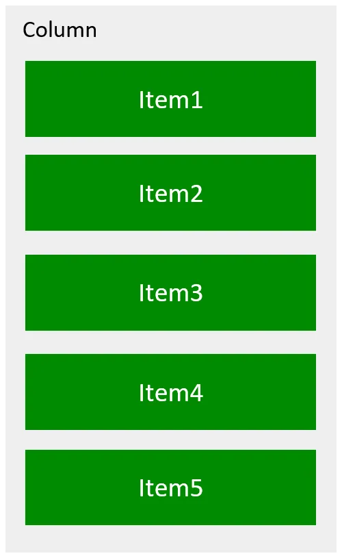
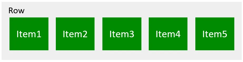
线性布局(LinearLayout)是开发中最常用的布局,可通过容器组件Column和Row构建,其子组件会在垂直或者水平方向上进行线性排列,具体效果如下图所示
说明:
Column和Row容器均有两个轴线,分别是主轴和交叉轴
- 主轴:线性布局容器在布局方向上的轴线,Row容器主轴为横向,Column容器主轴为纵向。
- 交叉轴:垂直于主轴方向的轴线。Row容器交叉轴为纵向,Column容器交叉轴为横向。
1.2 Column&Row参数
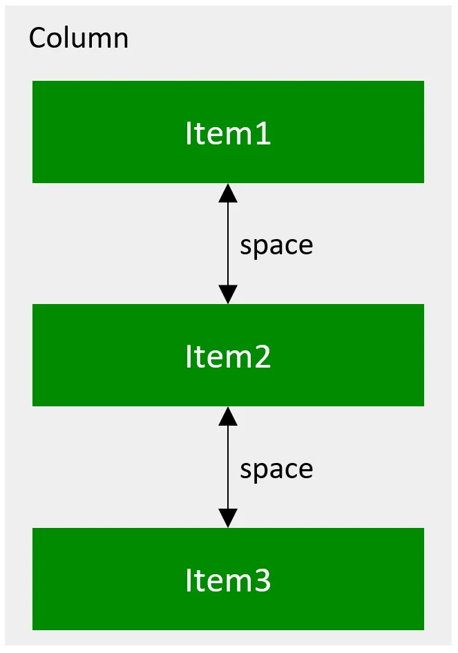
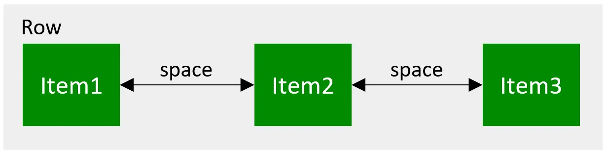
Column和Row容器的参数类型为{space?: string | number},开发者可通过space属性调整子元素在主轴方向上的间距,效果如下
示例代码:
pages目录下新建layout/linear目录,新建SpacePage.ets文件
@Entry
@Component
// 线性布局
struct SpacePage {build() {// 通过space属性调整子元素在主轴方向上的间距Column({ space: 150 }) {Row().backgroundColor(Color.Green).width('80%').height(70)Row().backgroundColor(Color.Green).width('80%').height(70)Row().backgroundColor(Color.Green).width('80%').height(70)}.width('100%').height('100%').backgroundColor('#eeeeee').justifyContent(FlexAlign.Center)}
}
1.3 常用属性
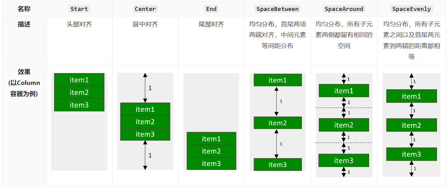
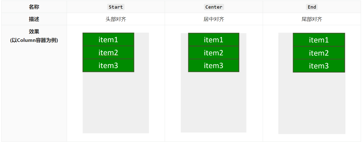
1.3.1 主轴方向排列方式
子元素沿主轴方向的排列方式可以通过justifyContent()方法进行设置,其参数类型为枚举类型FlexAlign,可选的枚举值有
示例代码:
pages/layout/linear目录,新建JustifyContent.ets文件
@Entry
@Component
struct AlignItemsPage {build() {Column({ space: 2 }) {Row().backgroundColor(Color.Green).width('80%').height(70)Row().backgroundColor(Color.Green).width('80%').height(70)Row().backgroundColor(Color.Green).width('80%').height(70)}.width('100%').height('100%')// 子元素沿主轴方向的排列方式// .justifyContent(FlexAlign.Center)// .justifyContent(FlexAlign.Start)// .justifyContent(FlexAlign.End)// .justifyContent(FlexAlign.SpaceBetween)// .justifyContent(FlexAlign.SpaceAround).justifyContent(FlexAlign.SpaceEvenly)}}
1.3.2 交叉轴方向对齐方式
子元素沿交叉轴方向的对齐方式可以通过alignItems()方法进行设置,其参数类型,对于Column容器来讲是HorizontalAlign,对于Row容器来讲是VerticalAlign,两者都是枚举类型,可选择枚举值也都相同,具体内容如下
示例代码
pages/layout/linear目录,新建AlignItemsPage.ets文件
@Entry
@Component
// 线性布局交叉轴排列方式
struct AlignItemsPage {build() {Column({ space: 2 }) {Row().backgroundColor(Color.Green).width('80%').height(70)Row().backgroundColor(Color.Green).width('80%').height(70)Row().backgroundColor(Color.Green).width('80%').height(70)}.width('100%').height('100%')// 子元素沿交叉轴方向的对齐方式// 对于Column容器来讲是HorizontalAlign,对于Row容器来讲是VerticalAlign,两者都是枚举类型,可选择枚举值也都相同// .alignItems(HorizontalAlign.Start)// .alignItems(HorizontalAlign.Center).alignItems(HorizontalAlign.End)}
}
二、使用技巧
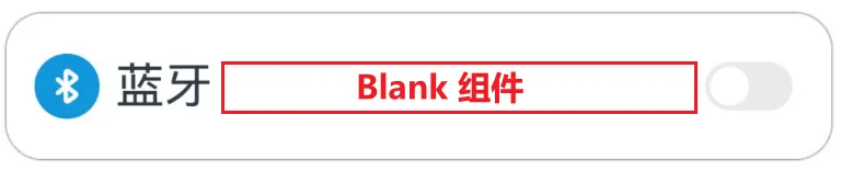
2.1 Blank组件
Blank可作为Column和Row容器的子组件,该组件不显示任何内容,并且会始终充满容器主轴方向上的剩余空间,效果如下:
示例代码:
拷贝icon_bluetooth.png到目录resources/base/media
pages/layout/linear目录下新建BlankPage.ets
@Entry
@Component
struct BlankPage {build() {Column({ space: 50 }) {Row() {Image($r('app.media.icon_bluetooth')).width(30).height(30)Text('蓝牙').fontSize(20).margin({ left: 5 })Blank()Toggle({ type: ToggleType.Switch })}.width('90%').height(60).backgroundColor(Color.White).padding({ left: 10, right: 10 }).borderRadius(15).shadow({ radius: 10 })}.width('100%').height('100%').justifyContent(FlexAlign.Center).backgroundColor('#f2f2f2')}
}
2.2 layoutWeight属性
layoutWeight属性可用于Column和Row容器的子组件,其作用是配置子组件在主轴方向上的尺寸权重。配置该属性后,子组件沿主轴方向的尺寸设置(width或height)将失效,具体尺寸根据权重进行计算,计算规则如下图所示:

示例代码:
pages/layout/linear目录下新建LayoutWeightPage.ets
@Entry
@Component// layoutWeight属性
struct LayoutWeightPage {build() {// layoutWeight 配置子组件在主轴方向上的尺寸权重。// 配置该属性后,子组件沿主轴方向的尺寸设置(width或height)将失效,具体尺寸根据权重进行计算Column() {//Header:高度60vpRow() {Text('Header').fontSize(30)}.backgroundColor('#66008000').justifyContent(FlexAlign.Center).height(60).width('100%')//Content:充满剩余空间Row() {Text('Content').fontSize(30)}.backgroundColor('#66ffa200').justifyContent(FlexAlign.Center).width('100%')// .height(200).layoutWeight(3)// Footer:高度60vpRow() {Text('Footer').fontSize(30)}.backgroundColor('#660e9fba').justifyContent(FlexAlign.Center).width('100%').height(60)}.width('100%').height('100%').justifyContent(FlexAlign.Center).backgroundColor('#f2f2f2')}
}
《鸿蒙应用开发从入门到项目实战》系列文章持续更新中,陆续更新AI+编程、企业级项目实战等原创内容,防止迷路,欢迎关注!