大家好,我是潘Sir,持续分享IT技术,帮你少走弯路。《鸿蒙应用开发从入门到项目实战》系列文章持续更新中,陆续更新AI+编程、企业级项目实战等原创内容、欢迎关注!
ArkUI提供了丰富的系统组件,用于制作鸿蒙原生应用APP的UI,在制作UI时会经常遇到代码或样式重复问题,本文通过ArkUI提供的适配器实现代码复用。
一、样式复用
1.1 概述
当多个组件具有相同的样式时,若每个组件都单独设置,将会有大量的重复代码。为避免重复代码,开发者可使用@Styles或者@Extend装饰器将多条样式设置提炼成一个方法,然后直接在各组件声明的位置进行调用,这样就能完成样式的复用。
1.2 @Styles方法
@Styles方法可定义在组件内或者全局,具体语法如下
- 组件内
@Entry
@Component
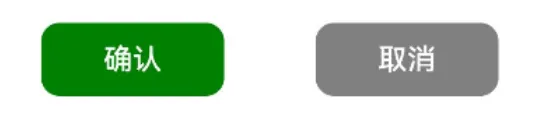
struct StylesPage {build() {Column() {Row({ space: 50 }) {Button('确认').type(ButtonType.Normal).backgroundColor(Color.Green).compButtonStyle() //复用样式.onClick(() => console.log('确认'))Button('取消').type(ButtonType.Normal).backgroundColor(Color.Gray).compButtonStyle() //复用样式.onClick(() => console.log('取消'))}}.width('100%').height('100%').justifyContent(FlexAlign.Center)}//组件内样式定义@Styles compButtonStyle() {.width(100).height(40).borderRadius(10)}
}
- 全局
@Entry
@Component
struct StylesPage {build() {Column() {Row({ space: 50 }) {Button('确认').type(ButtonType.Normal).backgroundColor(Color.Green).globalButtonStyle() //复用样式.onClick(() => console.log('确认'))Button('取消').type(ButtonType.Normal).backgroundColor(Color.Gray).globalButtonStyle() //复用样式.onClick(() => console.log('取消'))}}.width('100%').height('100%').justifyContent(FlexAlign.Center)}
}//全局样式定义
@Styles function globalButtonStyle() {.width(100).height(40).borderRadius(10)
}
注意
- 组件内的
@Styles方法只能在当前组件中使用,全局的@Styles方法目前只允许在当前的.ets文件中使用 - 组件内定义
@Styles方法时不需要使用function关键字,全局的@Styles方法需要使用function关键字 @Styles方法中只能包含通用属性方法和通用事件方法@Styles方法不支持参数
示例代码
pages/component目录下新建resue目录,新建StylesPage.ets文件
@Entry
@Component
struct StylesPage {build() {Column() {Row({ space: 50 }) {Button('确认').type(ButtonType.Normal).backgroundColor(Color.Green).compButtonStyle() //复用样式// .globalButtonStyle() //复用样式.onClick(() => console.log('确认'))Button('取消').type(ButtonType.Normal).backgroundColor(Color.Gray).compButtonStyle() //复用样式// .globalButtonStyle() //复用样式.onClick(() => console.log('取消'))}}.width('100%').height('100%').justifyContent(FlexAlign.Center)}//组件内样式定义@Styles compButtonStyle() {.width(100).height(40).borderRadius(10)}
}//全局样式定义
@Styles function globalButtonStyle() {.width(100).height(40).borderRadius(10)
}
1.3 @Extend方法
@Extend装饰的方法同样可用于组件样式的复用,与@Styles不同的是,@Extend方法只能定义在全局。并且@Extend方法只能用于指定类型的组件,例如以下方法只能用于Button组件(可以理解为是Button组件的扩展样式)
@Extend(Button) function buttonStyle(){...
}
由于@Extend方法只能用于指定类型的组件,因此方法中可包含指定组件的专有属性方法和专有事件方法。另外,@Extend方法还支持参数,具体语法如下
@Entry
@Component
struct ExtendPage {build() {Column() {Row({ space: 50 }) {Button('确认').buttonExtendStyle(Color.Green, () => console.log('确认')) //复用样式Button('取消').buttonExtendStyle(Color.Gray, () => console.log('取消')) //复用样式}}.width('100%').height('100%').justifyContent(FlexAlign.Center)}
}//样式定义
@Extend(Button) function buttonExtendStyle(color: Color, callback: () => void) {.width(100).height(40).borderRadius(10).type(ButtonType.Normal).backgroundColor(color).onClick(callback)
}
总结
@Extend方法只能定义在全局,使用范围目前只限于当前的.ets文件@Extend方法用于特定类型的组件,因此可包含该组件的专有属性方法和专有事件方法@Extend方法支持参数
示例代码
pages/component/resue目录下新建ExtendPage.ets文件
@Entry
@Component
struct ExtendPage {build() {Column() {Row({ space: 50 }) {Button('确认').buttonExtendStyle(Color.Green, () => console.log('确认')) //复用样式Button('取消').buttonExtendStyle(Color.Gray, () => console.log('取消')) //复用样式}}.width('100%').height('100%').justifyContent(FlexAlign.Center)}
}//样式定义
@Extend(Button) function buttonExtendStyle(color: Color, callback: () => void) {.width(100).height(40).borderRadius(10).type(ButtonType.Normal).backgroundColor(color).onClick(callback)
}
二、UI结构复用
2.1 概述
当页面有多个相同的UI结构时,若每个都单独声明,同样会有大量重复的代码。为避免重复代码,可以将相同的UI结构提炼为一个自定义组件,完成UI结构的复用。
除此之外,ArkTS还提供了一种更轻量的UI结构复用机制@Builder方法,开发者可以将重复使用的UI元素抽象成一个@Builder方法,该方法可在build()方法中调用多次,以完成UI结构的复用。

2.2 语法说明
@Builder方法同样可以定义在组件内或者全局,具体语法如下
- 组件内
@Entry
@Component
struct BuilderPage {build() {Column() {Row({ space: 50 }) {//复用UI结构this.compButtonBuilder($r('app.media.icon_edit'), '编辑', () => console.log('编辑'))this.compButtonBuilder($r('app.media.icon_send'), '发送', () => console.log('发送'))}}.width('100%').height('100%').justifyContent(FlexAlign.Center)}//定义UI结构@Builder compButtonBuilder(icon: Resource, text: string, callback: () => void) {Button() {Row({ space: 10 }) {Image(icon).width(25).height(25)Text(text).fontColor(Color.White).fontSize(25)}}.width(120).height(50).onClick(callback)}
}
- 全局
@Entry
@Component
struct BuilderPage {build() {Column() {Row({ space: 50 }) {//复用UI结构globalButtonBuilder($r('app.media.icon_edit'), '编辑', () => console.log('编辑'))globalButtonBuilder($r('app.media.icon_send'), '发送', () => console.log('发送'))}}.width('100%').height('100%').justifyContent(FlexAlign.Center)}
}//定义UI结构
@Builder function globalButtonBuilder(icon: Resource, text: string, callback: () => void) {Button() {Row({ space: 10 }) {Image(icon).width(25).height(25)Text(text).fontColor(Color.White).fontSize(25)}}.width(120).height(50).onClick(callback)
}
注意
- 组件内的
@Builder方法可通过this访问当前组件的属性和方法,而全局的@Builder方法则不能 - 组件内的
@Builder方法只能用于当前组件,全局的@Builder方法导出(export)后,可用于整个应用。
示例代码
拷贝icon_edit.png和icon_send.png文件到resources/base/media目录
pages/component/resue目录下新建BuilderPage.ets文件
@Entry
@Component
struct BuilderPage {build() {Column() {Row({ space: 50 }) {this.compButtonBuilder($r('app.media.icon_edit'), '编辑', () => console.log('编辑'))this.compButtonBuilder($r('app.media.icon_send'), '发送', () => console.log('发送'))// globalButtonBuilder($r('app.media.icon_edit'), '编辑', () => console.log('编辑'))// globalButtonBuilder($r('app.media.icon_send'), '发送', () => console.log('发送'))}}.width('100%').height('100%').justifyContent(FlexAlign.Center)}@Builder compButtonBuilder(icon: Resource, text: string, callback: () => void) {Button() {Row({ space: 10 }) {Image(icon).width(25).height(25)Text(text).fontColor(Color.White).fontSize(25)}}.width(120).height(50).onClick(callback)}
}@Builder function globalButtonBuilder(icon: Resource, text: string, callback: () => void) {Button() {Row({ space: 10 }) {Image(icon).width(25).height(25)Text(text).fontColor(Color.White).fontSize(25)}}.width(120).height(50).onClick(callback)
}
2.3 @Builder方法参数传递规则
@Builder方法具有两种参数传递机制——按值传递和按引用传递。当只有一个参数且参数为对象字面量时为按引用传递,其余情况均为按值传递。
按引用传递时,若传递的参数为状态变量,则状态变量的变化将会触发@Builder方法内部UI的刷新;按值传递时则不会。
示例代码
pages/component/resue目录下新建BuilderParameterPage.ets文件
@Entry
@Component
struct BuilderParameterPage {@State count: number = 0;build() {Column({ space: 50 }) {//按值传递valueTextBuilder(this.count)//按引用传递referenceTextBuilder({ count: this.count })Row({ space: 50 }) {Button('-1').onClick(() => {this.count--;})Button('+1').onClick(() => {this.count++;})}}.width('100%').height('100%').justifyContent(FlexAlign.Center)}
}@Builder function valueTextBuilder(count: number) {Text(`按值传递: ${count}`).fontSize(30).fontWeight(FontWeight.Bold)
}@Builder function referenceTextBuilder(obj: { count: number }) {Text(`按引用传递: ${obj.count}`).fontSize(30).fontWeight(FontWeight.Bold)
}
2.4 @Builder方法和自定义组件的区别
@Builder方法和自定义组件虽然都可以实现UI复用的效果,但是两者还是有着本质的区别的,其中最为显著的一个区别就是自定义组件可以定义自己的状态变量,而@Builder方法则不能。
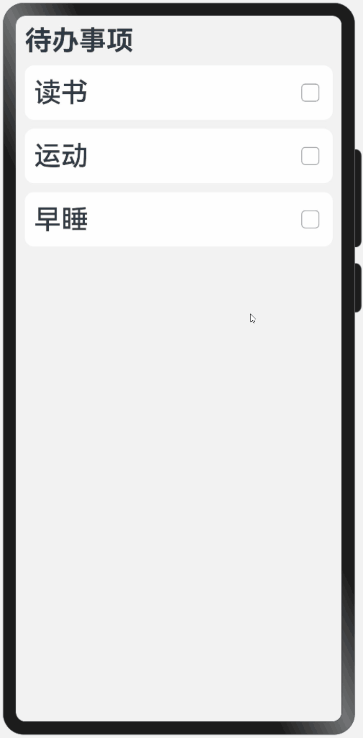
以下案例中,每个待办事项的UI结构都相同,因此可考虑将其提炼为一个自定义组件或者@Builder方法,但是由于每个待办事项均有已完成和未完成两种状态,因此需要为每个待办事项都定义一个状态变量,所以此时就只能使用自定义组件而不能使用@Builder方法。
总结
若复用的UI结构没有状态,推荐使用@Builder方法,否则使用自定义组件。
示例代码
pages/component/resue目录下新建DifferencePage.ets文件
@Entry
@Component
struct DifferencePage {build() {Column({ space: 10 }) {Text('待办事项').fontSize(30).fontWeight(FontWeight.Bold).width('100%')TodoItem({ text: '读书' })TodoItem({ text: '运动' })TodoItem({ text: '早睡' })}.width('100%').height('100%').justifyContent(FlexAlign.Start).padding(10).backgroundColor('#f2f2f2')}
}@Component
struct TodoItem {text: string;@State isDone: boolean = false;build() {Row() {Text(this.text).fontSize(30).fontWeight(FontWeight.Medium)//文本装饰线,根据isDone的值选择不同的类型.decoration({ type: this.isDone ? TextDecorationType.LineThrough : TextDecorationType.None })//用于填充Column/Row容器的剩余空间Blank()Toggle({ type: ToggleType.Checkbox }).onChange((value) => {this.isDone = value;})}.width('100%').height(60).backgroundColor(Color.White).padding(10).borderRadius(10)}
}
2.5 @BuilderParam
@BuilderParam用于装饰自定义组件(struct)中的属性,其装饰的属性可作为一个UI结构的占位符,待创建该组件时,可通过参数为其传入具体的内容。(其作用类似于Vue框架中的slot)。
- 组件定义
@Component
struct Container {//@BuilderParam属性@BuilderParam content: () => voidbuild() {Column() {Text('其他内容') //其他内容this.content(); //占位符Button('其他内容') //其他内容}}
}
- UI结构定义
@Builder function contentBuilder1() {...
}@Builder function contentBuilder2() {...
}@Builder function contentBuilder3() {...
}
- 组件创建
Container({ content: contentBuilder1 })Container({ content: contentBuilder2 })Container({ content: contentBuilder3 })
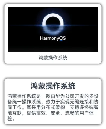
下面通过一个案例展示@BuilderParam的具体用法,例如,现需要实现一个通用的卡片组件,如下图所示
卡片中显示的内容不固定,例如
具体实现步骤如下:
(1)卡片组件定义
@Component
struct Card {@BuilderParam content: () => void; //@BuilderParam属性build() {Column() {this.content(); //占位符}.width('90%').padding(10).borderRadius(10).shadow({ radius: 20 })}
}
效果
(2)卡片内容定义
@Builder function imageBuilder() {Column({ space: 10 }) {Image($r('app.media.img_harmony')).width(300).height(150)Text('鸿蒙操作系统')}
}
效果图

(3)创建卡片组件
Card({ content: imageBuilder })

另外,如果一个组件中只定义了一个@BuilderParam属性,那么创建该组件时,也可直接通过"子组件"的方式传入具体的UI结构,例如
创建卡片组件
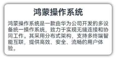
Card() {Column({ space: 10 }) {Text('鸿蒙操作系统').fontSize(25).fontWeight(FontWeight.Bold)Text('鸿蒙操作系统是...')}
}
效果图
示例代码
pages/component/resue目录下新建BuilderParamPage2.ets文件
@Entry
@Component
struct BuilderParamPage2 {build() {Column({ space: 50 }) {//创建卡片组件(传参)Card({ content: imageBuilder })//创建卡片组件("子组件")Card() {Column({ space: 10 }) {Text('鸿蒙操作系统').fontSize(25).fontWeight(FontWeight.Bold)Text('鸿蒙操作系统是一款由华为公司开发的多设备统一操作系统,致力于实现无缝连接和协同工作。其采用分布式架构,支持多终端智能互联,提供高效、安全、流畅的用户体验。')}}}.width('100%').height('100%').justifyContent(FlexAlign.Center)}
}//卡片内容
@Builder function imageBuilder() {Column({ space: 10 }) {Image($r('app.media.img_harmony')).width(300).height(150)Text('鸿蒙操作系统')}
}//卡片组件
@Component
struct Card {@BuilderParam content: () => void; //@BuilderParam属性build() {Column() {this.content(); //占位符}.width('90%').padding(10).borderRadius(10).shadow({ radius: 20 })}
}
《鸿蒙应用开发从入门到项目实战》系列文章持续更新中,陆续更新AI+编程、企业级项目实战等原创内容,防止迷路,欢迎关注!